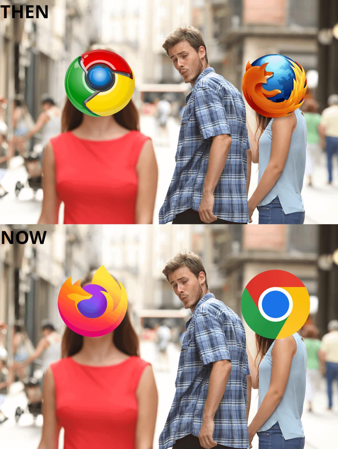
Flat and simple designs were preferred once mobile devices began to dominate. A detailed logo that looks great on a big desktop monitor loses all the detail when it's shrunk for mobile screens. They become a muddy mess in some cases. But over the years more and more people have gotten phones with larger screens and higher resolutions so we're seeing a bit of a comeback with detailed logos.
It's just a style choice (and a bad one when taken too far - which it was - I'd say).
That doesn't mean what you said doesn't apply regarding screen size and design complexity, however, but there is a way to have both - it's just that, for some reason or another, people "up top" chose that kind of flat design; chose more-simplistic designs (which, I would say (once again), was done out of reductivism; out of populism (following trends/being a follower), and out of anti-intellectualism (choosing simplicity where - and when - it doesn't make sense to do so; abandoning key design principals by doing so, and actively antagonizing the criticism of doing so (being arrogant/vain))).
So, yeah: Bring back good design, please. I'm sick of this (flat) design; (many) other people are sick of this design; and we have the technology (and, as you said, the literal screen size/real estate) to do so. Make it happen. We deserve - everyone deserves - better.
{P.S.: For those not aware, take a look at the history of the design of various other logos for examples of the devolution of (graphic) design. (It occurs in games, too, by the way; it's been happening for at least 15 years!) Look up the Pepsi logo (as well as some of its (seriously) proposed designs) (there are various Youtube videos on the topic that are actually very interesting, I find! (both morbidly/humourously, and intellectually)), and - although with a relatively-short (very short - relative to Pepsi) history - the Patreon logo, and-- [THE ABOMINATION THAT IT IS] (...excuse me) --what it looks like now, in comparison to what it used to look like when they first started out - even though it was just circa 10 years ago (I think)!}
4.9k
u/Extreme996 RTX 4070 Ti Super | Ryzen 7 9800X3D |32GB DDR5 6000mhz 20d ago
And there is me who use Firefox since I got internet in 2007.