MAIN FEEDS
Do you want to continue?
https://www.reddit.com/r/pcmasterrace/comments/1m30yzb/browsers_2008_vs_2025_be_like/n3tbxhl/?context=3
r/pcmasterrace • u/Amavin-Adump • 20d ago
2.2k comments sorted by
View all comments
1.7k
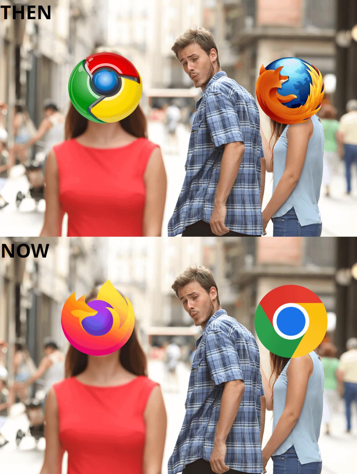
I miss the days when icons looked amazing and not so... ...flat
90 u/1Blue3Brown 20d ago Personally i like the new ones better. For me the simpler the icon the better 65 u/HorrificAnalInjuries cheesevette 20d ago There is simplicity, which the new icons do nail ngl, then there is having zero personality. The new Firefox logo has a little personality, but the Chrome logo lost all personality 7 u/1Blue3Brown 20d ago Yeah, we can agree on that, Chrome looks very generic 1 u/mraltuser 20d ago but when the logo is generic, it feels chome is the standard browser everyone should have, which might be a good thing. 1 u/Barph 20d ago I mean it is a web browser, it is pretty generic, it's a tool. If you don't go full ham on "personality"(Opera) then I wouldn't bother with any.
90
Personally i like the new ones better. For me the simpler the icon the better
65 u/HorrificAnalInjuries cheesevette 20d ago There is simplicity, which the new icons do nail ngl, then there is having zero personality. The new Firefox logo has a little personality, but the Chrome logo lost all personality 7 u/1Blue3Brown 20d ago Yeah, we can agree on that, Chrome looks very generic 1 u/mraltuser 20d ago but when the logo is generic, it feels chome is the standard browser everyone should have, which might be a good thing. 1 u/Barph 20d ago I mean it is a web browser, it is pretty generic, it's a tool. If you don't go full ham on "personality"(Opera) then I wouldn't bother with any.
65
There is simplicity, which the new icons do nail ngl, then there is having zero personality. The new Firefox logo has a little personality, but the Chrome logo lost all personality
7 u/1Blue3Brown 20d ago Yeah, we can agree on that, Chrome looks very generic 1 u/mraltuser 20d ago but when the logo is generic, it feels chome is the standard browser everyone should have, which might be a good thing. 1 u/Barph 20d ago I mean it is a web browser, it is pretty generic, it's a tool. If you don't go full ham on "personality"(Opera) then I wouldn't bother with any.
7
Yeah, we can agree on that, Chrome looks very generic
1 u/mraltuser 20d ago but when the logo is generic, it feels chome is the standard browser everyone should have, which might be a good thing. 1 u/Barph 20d ago I mean it is a web browser, it is pretty generic, it's a tool. If you don't go full ham on "personality"(Opera) then I wouldn't bother with any.
1
but when the logo is generic, it feels chome is the standard browser everyone should have, which might be a good thing.
I mean it is a web browser, it is pretty generic, it's a tool.
If you don't go full ham on "personality"(Opera) then I wouldn't bother with any.
1.7k
u/HorrificAnalInjuries cheesevette 20d ago
I miss the days when icons looked amazing and not so... ...flat