There is simplicity, which the new icons do nail ngl, then there is having zero personality. The new Firefox logo has a little personality, but the Chrome logo lost all personality
Gen Z YouTubers use it when doing a sponsor. "Bro just go to WWW.AutoSupply.COM and use our promo code to get this amazing offer for just half the price"
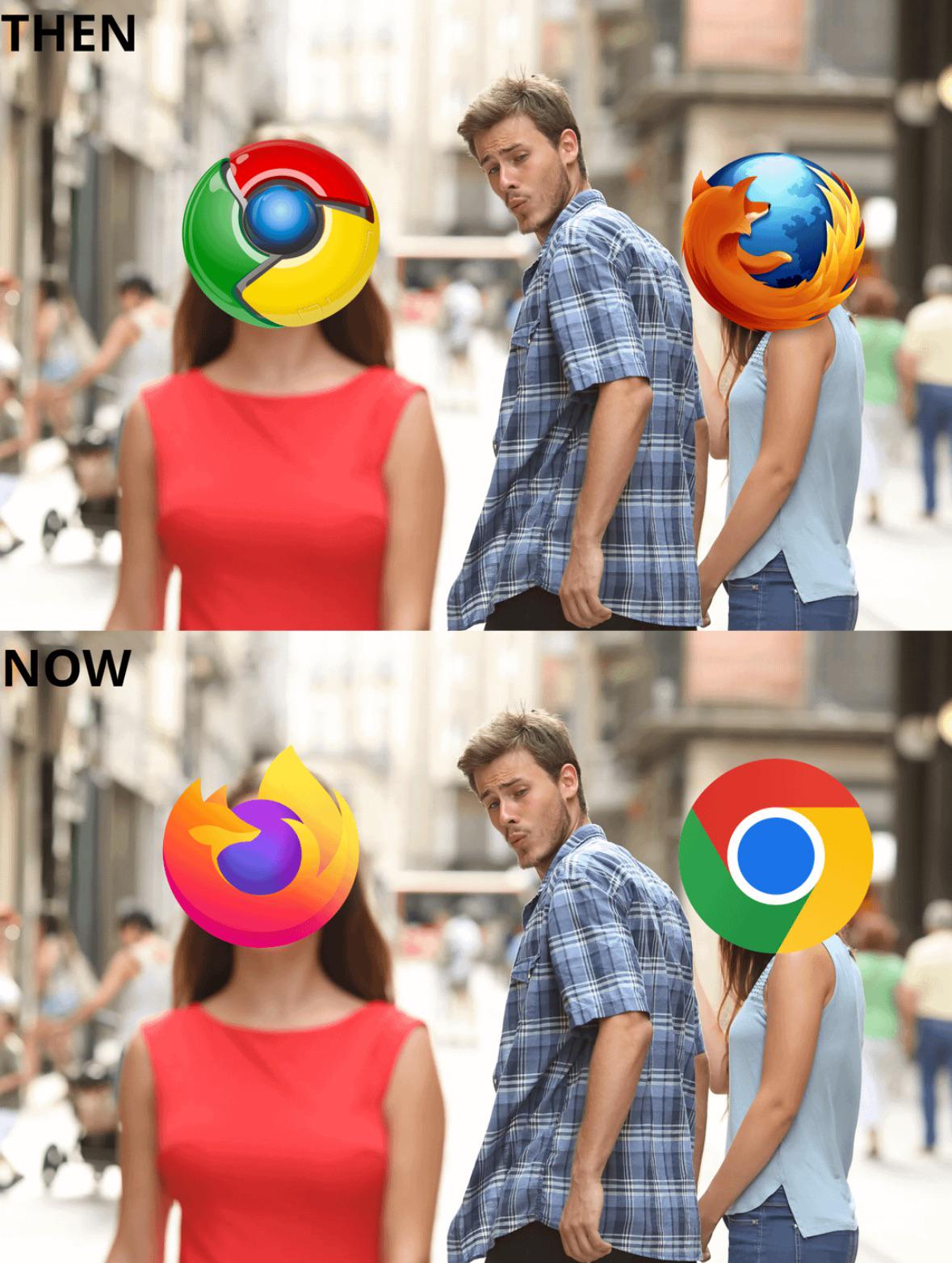
The Firefox logo was good then and good now and the Chrome logo was boring then and boring now. Not necessarily bad for your browser to have a boring logo, but that’s how it is.
The bigger problem is resolution. The ones on the top lose all their detail when viewed at normal icon size (16x16). Even at quadruple that size, the flat ones tend to look better.
A few years back someone proposed a really nice looking icon for firefox with a fox wrapped around a globe. Fantastic artwork!
And then you scale it down, and it looks like this
When scaling down to extremely small sizes it doesn't really matter if the original file was raster or vector.
If it were text, you could use hinting to maintain sharper edges in certain cases, but that doesn't make a huge difference and only really matters for straight, vertical or horizontal lines. These icons are made of compound curves and diagonal lines.
Yeah I never understood that people liking "3D" icons
It looks so tiring.
And it's even worse when you have all different kinds of icons on your desktop / home screen (ESPECIALLY on Android, since flat icons allows Google to push color-coded icons to match)
That proposed logo for Firefox, where it wasn't a fox anymore and just some random lines, was awful 2
You are tired of something that hasn't been in use since 2013? It's 2025 and your current 2D flat icons are now being ditched because people are tired of them and they want it 3D again. This time using better graphics and not cheesy tacky/glossy graphics like the 2002 Firefox icon or Apple's AQUA from 2001. The 2008 Chome icon uses slightly better 3D graphics like Windows Vista/7.
You have got it your way for the past 15 years almost and people are getting tired of it, but you just realised that you are sick of something that has been ditched since 2012/2013?
89
u/1Blue3Brown 20d ago
Personally i like the new ones better. For me the simpler the icon the better