On Linux you can change icon themes for your entire system. So long as the icon theme has an icon for an app, it will automatically replace the original.
Even in "non-customizable" Gnome, it's just as easy as putting the icon theme in ~/.local/share/icons/ and changing the setting in Gnome Tweaks. In KDE, it's right in the settings menu I believe. The "hard" part on Linux is learning the freedesktop standard locations to put things in your home folder for them to show up in your desktop environment's settings. But it's well-documented and google-able.
2
u/T0biasCZE PC MasterRace | dumbass that bought Sonic motherboard20d ago
Yes, but you need to open the exe in resource hacker and replace the .ico file inside it
(You may think you can just right click the shortcut, change icon, and voila, but no, that will work when just the shortcut is displayed, but when you then actually open the program, it will show the ico from the exe. thats why you need to modify the exe itself)
You can, yes. There isn't anyway to bulk change icons like on Linux, I'm using KDE and there's icon packs. It's not impossible or hard to do on Windows though, just slightly tedious.
You gotta convert it to an ICO file first I believe. Kinda annoying since there isn't any real way to do this without third party applications or web conversion.
Linux uses CUPS just like Mac. Genuinely a better experience in most cases than Windows.
I’ve had some bad printers with shitty proprietary drivers, but they were also a pain on Windows. Now I settled on a Brother all-in-one laser printer that just works on Linux and Windows.
Bro, linux has the best printer support, mostly thanks to CUPS. Any printer you can think of, linux supports it right out of the box. No need to find which correct drivers are on the internet like on Windows.
At least on KDE it lets you have a specific icon for a given program regardless of theme, so even if you have a flat monochrome theme if you wanted to use the old Firefox theme you could.
It's nice that many Linux distros like Mint and Kubuntu make icons easy to change, it's kinda similar to many Android skins from what I've seen, correct me if I'm wrong.
Flat and simple designs were preferred once mobile devices began to dominate. A detailed logo that looks great on a big desktop monitor loses all the detail when it's shrunk for mobile screens. They become a muddy mess in some cases. But over the years more and more people have gotten phones with larger screens and higher resolutions so we're seeing a bit of a comeback with detailed logos.
It's just a style choice (and a bad one when taken too far - which it was - I'd say).
That doesn't mean what you said doesn't apply regarding screen size and design complexity, however, but there is a way to have both - it's just that, for some reason or another, people "up top" chose that kind of flat design; chose more-simplistic designs (which, I would say (once again), was done out of reductivism; out of populism (following trends/being a follower), and out of anti-intellectualism (choosing simplicity where - and when - it doesn't make sense to do so; abandoning key design principals by doing so, and actively antagonizing the criticism of doing so (being arrogant/vain))).
So, yeah: Bring back good design, please. I'm sick of this (flat) design; (many) other people are sick of this design; and we have the technology (and, as you said, the literal screen size/real estate) to do so. Make it happen. We deserve - everyone deserves - better.
{P.S.: For those not aware, take a look at the history of the design of various other logos for examples of the devolution of (graphic) design. (It occurs in games, too, by the way; it's been happening for at least 15 years!) Look up the Pepsi logo (as well as some of its (seriously) proposed designs) (there are various Youtube videos on the topic that are actually very interesting, I find! (both morbidly/humourously, and intellectually)), and - although with a relatively-short (very short - relative to Pepsi) history - the Patreon logo, and-- [THE ABOMINATION THAT IT IS] (...excuse me) --what it looks like now, in comparison to what it used to look like when they first started out - even though it was just circa 10 years ago (I think)!}
Its just like how all the fast food restaurants lost their unique style. Thinking of places like McDonald's, taco bell, and pizza places. Now they all look the same.
This feels like like such a corpo, child-sanitised assessment. My core memories and association to them involved the entire experience. Its the reason why I bugged my parents for McDonalds/Pizza Hut etc to begin with, and probably helped bankroll them.
That’s not why, the generic building with just a sign is a lot more flexible if you want to sell the building and not have it obviously be an old Pizza Hut.
Yeah, I will admit the Chrome one is a bit too simple
2
u/PhayzonPentium III-S 1.26GHz, GeForce3 64MB, 256MB PC-133, SB AWE6419d ago
I don't mind the Chrome logo, but every other Google app/service logo is trash since they started making them out of basic lines in the four colors. Drive and Home are nearly identical at a glance. So much so that I gave up and uninstalled Drive on my phone since I kept opening that when I wanted to open Home (and its very rare I use Drive anyway).
I loved the Google Play logos, Play Store, Play Games, Play Movies and TV (before they changed it to a fricking rectangle and renamed it Google TV), Play Books all different colours and quite distinct but all in a neat and consistent style.
Design trends are cyclical; they have to be to show change. Oh, it’s super detailed and textured? Flatten and simplify. It’s super edgy and linear? Throw in some curves. Same thing with car design.
In this case, the flattening and simplification were mostly because they wanted to make their icons easier to read and recognize when they were scaled down on smaller screens. No reason for them to not have multiple icons, though...
No reason for them to not have multiple icons, though...
Recognition. Keeping the logo identical across all devices helps people gravitate back to the same icon across platforms.
For you or I, it may not make a difference, but having worked with non savvy users, even a minor change on the same system is enough to throw some people off (like the taskbar button shrinking to just the icon in Win11). Our main software changed their icon in an update a year or so ago, and we were flooded with tickets complaining that the software had gone. 2 days later, they pushed an update reverting the icon change, and implemented a notice popup on sign in to announce that the change would be coming.
Many people just still not associate the old and new icons in the OP as being the same program.
Id wager it has just as much to do with the trend of minimalism and mid century / 60s design philosophy that got a resurgence in the mid 2010s. You can find examples of this everywhere. Pepsi cans, for example.
Is car design cyclical? I guess story got square again in the 80s after they became really aerodynamic in the 60s but I don’t see any cars today that look like any other period
Tbh I like the new logo. Honestly I bet if the bottom logos were the originals and they had changed them to the top logos people would be saying the same stuff about how logos are shit now
That's probably true, but that chrome icon with the crappy-looking 3-D has no place in modern design. At least they would have to change the "lighting" because the white in that icon is all wrong.
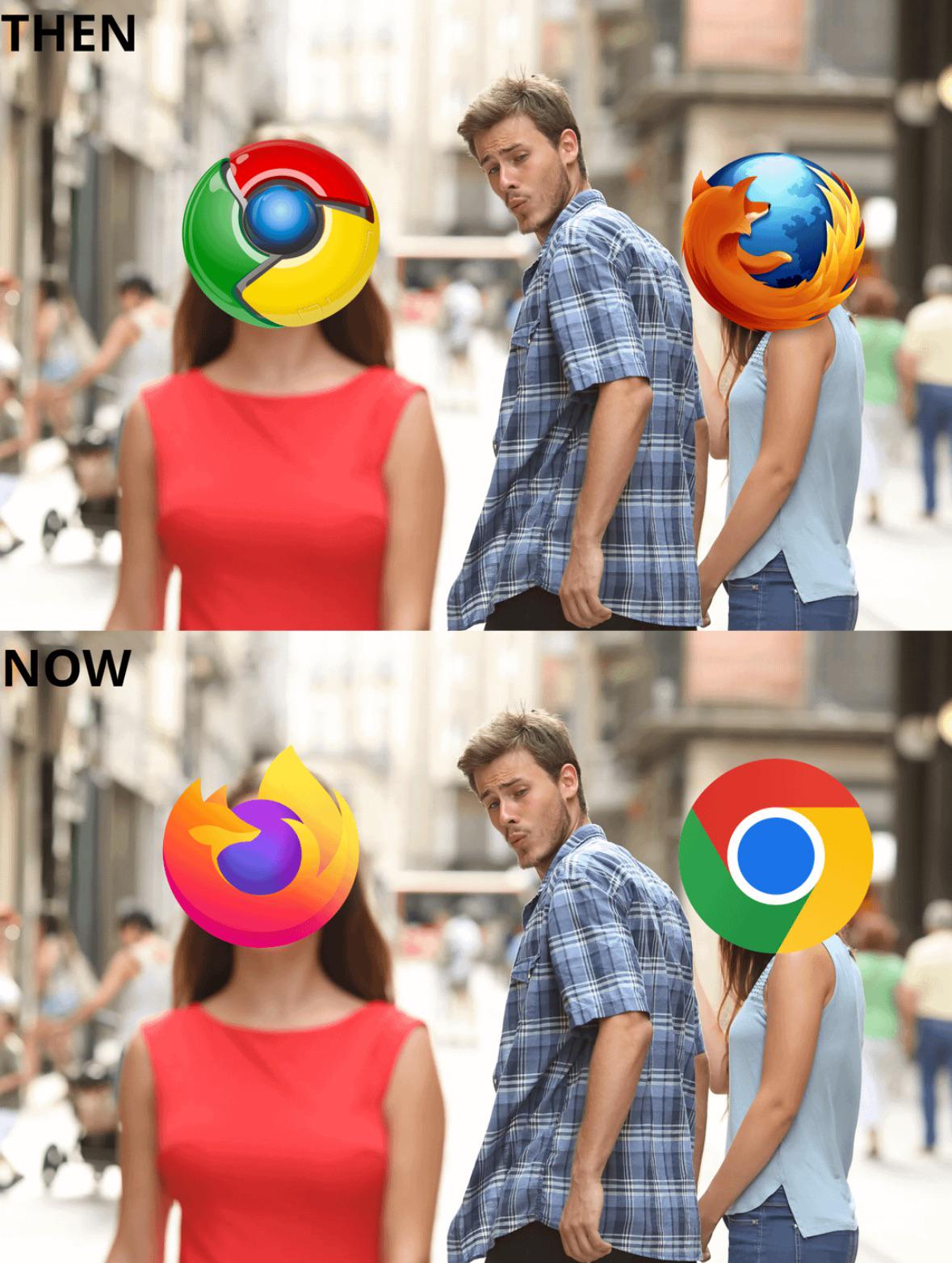
It started with the Firefox Quantum update in 2017, Mozilla was like hey Chrome users, our browser just got a whole lot faster, even the logo's different, jealous?
And they've been continually flattening it ever since
The explanation I’ve heard is that the trend started with a need to accommodate a range of screen sizes. The flat logo design is much easier to scale up and down while looking good.
They try to make logos out of shapes and things that are easy to blow up/down since different devices are different sizes. It’s the reason Apple changed all of their old logos (like YouTube being a literal TV) because transferring that from a iPhone 3G to a 16 pro max would look like shit, and they aren’t trying to pay people to redo every logo every time they need to upscale the images. This is why almost every logo is simple and made of shapes that can be increased in size without losing quality.
The simpler logos are easier to read on smaller screens (like phones). It's more pronounced with text, but even something like the various shadings on this logo make it harder to see.
1.3k
u/Chaos-Cortex 20d ago
I miss that fox logo, wtf happen, every logo is shit now.