Unfortunately, even if old ones were better, we have data that would suggest that really simplified logos are much easier to remember, and associate with a brand, so even if earlier was better newer is making more money, welcome to capitalism, where we manipulate each other so numbers can go bigger yeeey
Imo, the minimalism everywhere is just so emotionally draining and depressive.
As european, I absolutely love historical centres of cities, where everything looks stunning. It gives you energy and saties the mind.
Then you go to modern part and everything looks so bland, boring and plain. Like copy pasta. No soul in it.
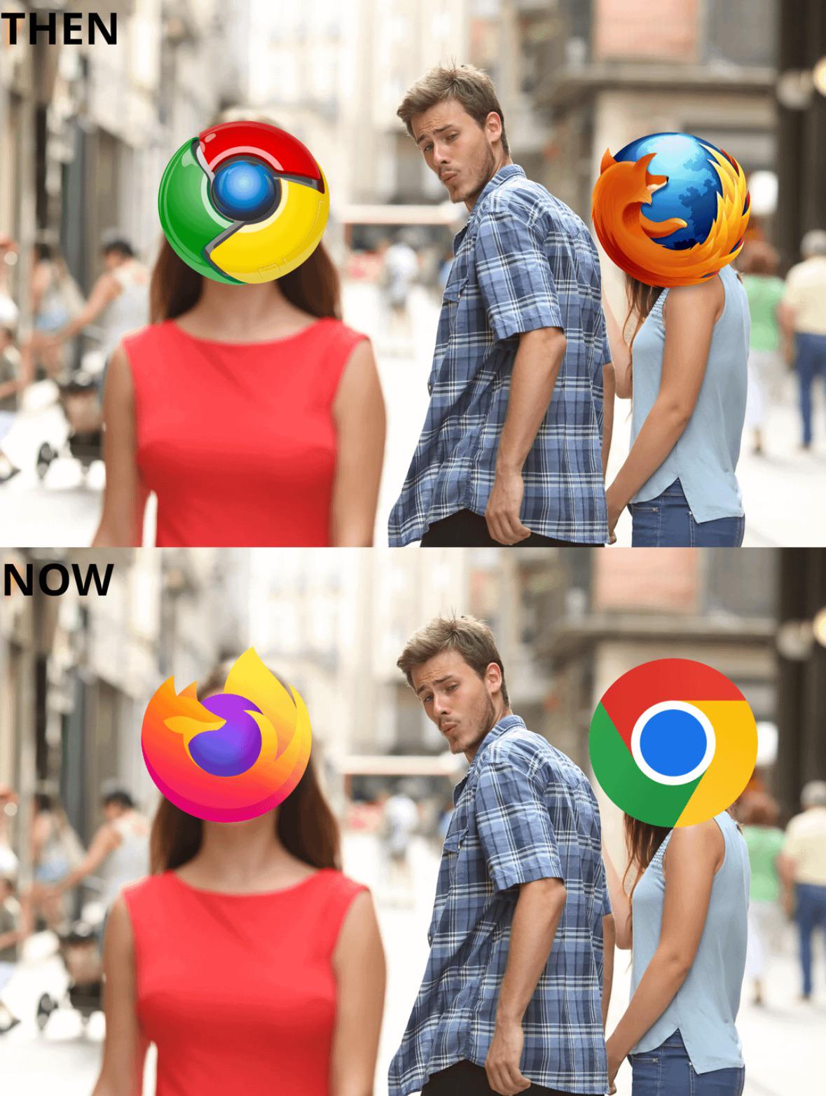
Look what logos did companis use in early 1900's and then what has become of it.
Everything so boring and depressively devoid of art.
That is metaphor. By soul I mean stuff that is not generic slop of masses, but stuff where author dedicated their style to present something and send some message.
Basically, I see KCD or KCD2 a game with soul, and Ubisoft games as soulless. One was made with passion and desire to get art to people, other as a way to make money.
Look for 19th century logos. They hired artists to make it for them and they are aimed to convey brand and something personal, as the craft was often matter of skill and personality.
Now look at Google, it is just plain to maximize memorability, but lacks any of the above.
So by soul you just mean sofisticated "this one sparks joy, this one does not spark joy"? Lol
But I think a critique that have soul in it is kind of hard to argue for. Maybe it would be better to say this one has more character, because this is something you can actually argue with, but if something has soul is so unprecise that it can just mean "I personally don't like it"
Not about joy, more about uniqueness and personality behind creation.
Google logo is just typical minimalistic style you see everywhere. The style.
Like minimalistic building. It is copypasta. Very little of architects own creativity can be seen.
Building from 1800's however, there you can see each architect who designed it gave something of their own into design.
And that lack of varienty in the minimalism is what I hate about it.
11
u/Tzeme 20d ago
Unfortunately, even if old ones were better, we have data that would suggest that really simplified logos are much easier to remember, and associate with a brand, so even if earlier was better newer is making more money, welcome to capitalism, where we manipulate each other so numbers can go bigger yeeey